Using the Interactive Fact Book
In the University of Kentucky Interactive Fact Book, you will find institutional data pertaining to the students enrolled at the University and the employees and faculty who work here. The data found in the Interactive Fact Book is the same as what would be found in the printed fact book produced annually by the Office of Institutional Research. The only difference is that this data is now made available through Tableau dashboards on our website. This allows you to interact with and analyze the data in more meaningful ways.
If you have not used a Tableau dashboard before, below are helpful tips on actions to engage with the data, as well as explanations of features that are unique to individual dashboards.
Tableau dashboards often contain multiple sheets. Using the tabs along the top of the dashboard, you can navigate through the different sheets. If there are many sheets in the dashboard, click on the arrows on the left and right sides of the tab header to view the available tabs.
Tooltips are data details that appear when you hover over one or more marks in a view.
Highlighting is a way to call attention to a subset of data in a view. This can be helpful when there are multiple data points clustered within a visualization that are hard to distinguish. The data points will be highlighted when clicked, and the remaining data points will be grayed out, making those that you selected easier to see. Click on any of the white space within a visualization to clear the highlighting.
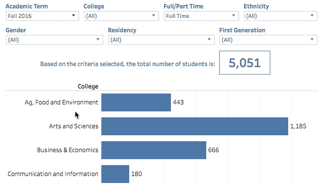
Drill down to view specific sets of data using filters. There are various filters available on many of the Interactive Fact Book dashboards that can help narrow the scope of the data based on what you are looking for. Filters can range from time-based information like year and term to demographic information like gender and ethnicity to academic information like college and degree level. Utilize one or many filters to achieve the data set you desire. Note that the filters will affect all visualizations on the page.
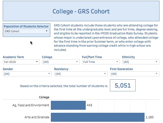
Population selectors are overarching filters that will refine the entire sheet for a specific population based on business rules. These populations are defined internally so that users can be confident they are viewing the correct subset of data. Other filters on the page will only display options available within the context of the population chosen. Thus, selecting a population to view is "fool-proof". While any of the populations can also be reached by using the filters provided on the whole set of data, it is much easier to choose the desired population from the start.
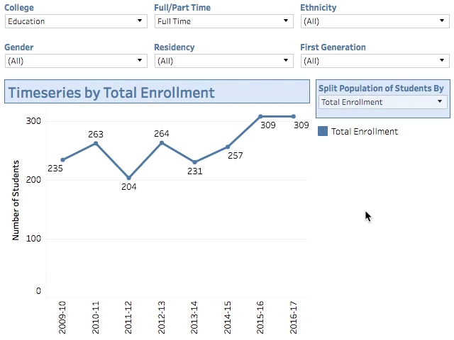
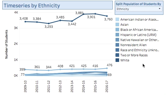
The timeseries split allows users to breakdown the data displayed in a timeseries to view certain traits over time. Traits can include anything from demographic information like gender and ethnicity to academic information like full/part time status and degree level. Splitting the timeseries by these traits, instead of just filtering for them on the default view, allows for more comparison of data. Filters can still be applied to timeseries splits to help drill down for specific comparison.