
Cornerstone Digital Media Wall Best Practices
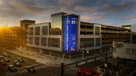
Towering over a prominent intersection, the 55-foot tall by 28-foot-wide digital media wall wrapping the corner of Limestone and Winslow streets is the first of its kind in Lexington. And the largest semi-opaque exterior screen on any campus in the U.S. Strategically situated on one of the university’s most downtown and community facing corners, attached to a large parking structure where the majority of campus visitors park, and associated with the university’s new marquee esports and innovation space, the Cornerstone digital media wall elevates the university’s brand. With that being said, it is important that this screen remains true to the university’s message as opposed to specific things that take place at the university. We are trying to promote the feeling that comes from going here as opposed to the events that occur.
Design specifications for digital content are as follows:
- Vertically oriented still digital image
- File: jpeg, jpg
- Canvas size in pixels: 1024x2176 pixels both sides combined with a corner break down the middle. (Each side is 512 x 2176 pixels). Images can be scaled up or down if they are in the correct aspect ratios. Other canvas sizes include: 256x455, 512x1088, 2048x4352.
- Canvas size in inches: 14x30 inches preferred, other sizes in inches include: 3x7 inches, 7x15 inches, 28x60 inches.
- Pixel Pitch: 32mm
- Color Mode: RGB
- Aspect ratio: 8:17, with corner pin to the top left.
- Pixels per inch (PPI): High (300 ppi)
Content best practices
- Relevance: Use imagery and symbols that are relevant to the viewer. Be careful when including images that are very attention-grabbing, as these can easily divert attention from the core message.
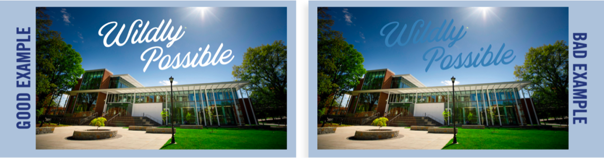
- Text: Text is most readable when it is bold and large against opposing colors. Avoid small text for it won’t be visible. To further enhance the viewing experience, optimize the size of your text for the distance your audience will view your screens from. Refer to example below.
- Color: Used well, color helps people absorb, learn and recall information. Use color to engage viewers. Feel free to use whatever colors you’d like, but high contrasting colors are preferred. For example: use white text on a black background, or even purple against yellow. These color combinations aren’t required so be sure to have fun with it!
-
- Textures: Textures do not show up well on the semi-opaque screen unless a high contrast is used.
- Images: Be sure to account for the corner split down the middle of the image. High contrast is best to show the detail in an image. Must be free of profanities, nudity, or any obscene, suggestive behavior.
NOTE: Selected images will be wrapped around a two-sided screen that is semi-opaque (see example image). Works that are bright and have little shadow detail show up best.
If you have any questions or comments feel free to reach out to the content managers for this screen, Blair Conner (blair.conner@uky.edu) and Zimaud Harley (zimaud.harley@uky.edu).